« J’ai choisi d’être designer graphique. Cela s’est fait en deux étapes, grâce au hasard des rencontres. Dans les années 80, pour entrer à l’école des arts appliqués Duperré, il fallait choisir une filière, je me suis inscrit en « Expression Visuelle / Graphic Design» sans savoir réellement ce que c’était. J’ai eu un professeur très important pour moi, Roger Druet, qui m’a initié à la calligraphie, la Caroline, la Gothique, l’Onciale… Je fais partie de cette génération de mutants où l’on dessinait tout à la main, avec une pointe Rotring, une équerre, un calque. On nous apprenait une dextérité, un savoir-faire manuel qui demandait beaucoup d’efforts, de persévérance et de pratique. Après on goûtait également la joie victorieuse d’y arriver.
Bref en deuxième année il fallait faire un stage et ce professeur m’a conseillé d’aller à Amsterdam chez Total Design. J’y suis arrivé en 1983, j’étais le seul français au milieu d’hollandais, d’allemands, de suisses et de britanniques. J’ y ai appris la rigueur et une certaine forme d’austérité héritées de l’esprit protestant. Je suis revenu en France et j’ai préparé le concours aux Arts Décoratifs de Paris. Parallèlement pour gagner ma vie, je faisais beaucoup d’illustrations. Je me sentais toujours décalé. J’ai appris que la Cité des Sciences à La Villette venait juste de confier à Total Design la création de la signalétique. Je décide de retourner en stage chez eux et de leur proposer de faire le lien sur ce projet, ce qu’ils ont accepté. Pendant ce second stage ils m’ont fait participer à la création graphique de plusieurs projets pour le musée Boijmans de Rotterdam.
C’est vraiment à ce moment-là que j’ai choisi le design graphique car j’ai compris que je pouvais y insuffler tout ce que j’aimais : le mouvement, la danse, la mise en scène, la peinture. En même temps je découvrais les collections du Stedelijk Museum. Tout m’a parlé, tout s’est connecté : l’abstraction, la géométrie, qui pouvaient être utilisées de façon expressive et pas uniquement de manière juste fonctionnelle ou sous forme de revendication politique. Bref cela convenait aussi à mon envie d’indépendance. »

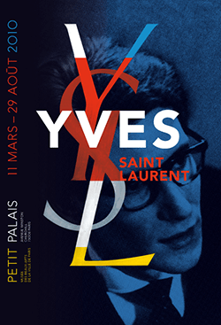
Philippe Apeloig est connu pour ses affiches, il a notamment signé celle de l’exposition « Chicago, naissance d’une métropole » au Musée d’Orsay (1987), celle d’ «Yves Saint Laurent » au Petit Palais (2010). Il crée typographies et alphabets diffusés par la fonderie Nouvelle Noire et des identités visuelles dont celle de la Direction des Musées de France.
On lui doit les logos du domaine de Chaumont sur Loire, de Puiforcat, du musée Yves Saint Laurent à Marrakech, pour n’en citer que quelques uns. Enseignant aux Etats Unis pendant 5 ans, à Rhodes Island School of Design puis à la Cooper Union of Art de New-York, son travail a été exposé internationalement. En 2013, le musée des Arts Décoratifs de Paris lui consacre sa première rétrospective, le Stedelijk Museum d’Amsterdam, la Dai Nippon Printing et la GGG Ginza Graphic Gallery à Tokyo ont également exposé son oeuvre.
« Selon moi une identité visuelle doit arriver à créer un sigle qui s’inscrit dans la mémoire de tous et qui provoque une émotion indéfinissable. Cela nécessite qu’il soit épuré, sinon il est difficile de s’en souvenir. Cela dit, c’est comme un résumé de texte, il ne faut pas qu’il soit trop sec non plus, d’où l’émotion à insuffler. Après interviennent beaucoup de contraintes techniques, le fonctionnel et le fait qu’il puisse résister dans le temps alors qu’il est très lié à l’éphémère, celui des affiches et des magazines. Une identité vit un certain nombre d’années, elle nous accompagne tous, elle a une dimension d’art populaire.
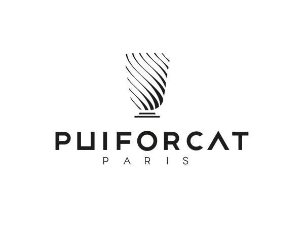
Logotype Puiforcat 2012 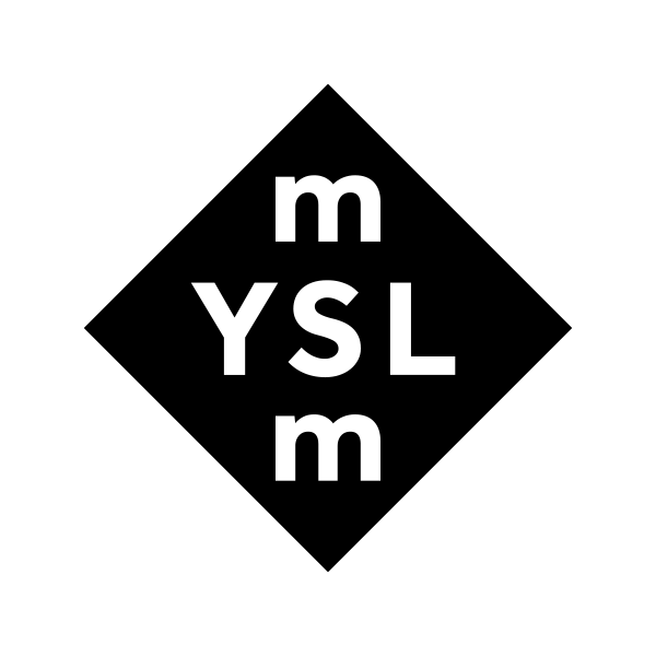
Logotype
Musée Yves Saint Laurent Marrakech, 2017
Logotype Domaine de Chaumont-sur-Loire: logotype
L’art, c’est comme de l’oxygène ou l’eau. On a besoin de cela, il y a quelque chose de vital et à la fois qui laisse une trace dans la mémoire. Les artistes, souvent malgré eux, sont dans la transgression, libres comme l’air et nécessaires comme l’eau. Ils ont ce besoin de s’exprimer, de magnifier, avec une dimension émotionnelle.

Mon premier travail c’était pour le Musée d’Orsay. C’est indéniable, je leur dois beaucoup. J’ai répondu à une annonce, ils m’ont choisi comme graphiste maison alors que j’étais très jeune et inexpérimenté. Grâce à eux, j’ai participé à l’ouverture du musée, je suis arrivé en 1985 et l’ouverture s’est faite en décembre 1986. Comme je m’occupais des publications non commerciales, j’ai réalisé l’affiche pour leur première exposition manifeste. « Chicago, naissance d’une métropole » donnait le ton de ce que serait le musée et de ce qu’il ne serait pas. Ce ne serait pas un musée uniquement de peintures, ou seulement consacré au XIXème siècle. Il serait pluri-disciplinaire et international se focalisant sur l’architecture, la sculpture et la peinture réalisées entre 1848 et 1914, soit entre la seconde République et la première guerre mondiale. Comme spectateur, on arrivait face à la sculpture, sans vraiment de peintures autour, c’était fort.
Tu me demandes mes inspirations. Pour ma discipline, je pense à Paul Rand, évidemment. C’est un pionnier du graphisme américain, il a construit à lui seul une école de design : culture de l’image, branding, pop art, à partir de la société de consommation. Il a mis en place un système de reconnaissance des marques, entre autres il a crée des logos d’IBM, de Yale et pour plusieurs compagnies de transport qui durent encore. Bref c’était un visionnaire, une icône de la modernité qui a transgressé pas mal de choses pour y arriver.
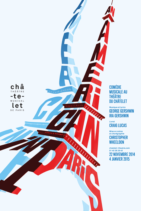
Châtelet Théâtre musical de Paris
2014
Evidemment la rencontre avec les oeuvres de Mondrian a été aussi déterminante. C’est un regard didactique sur la façon de parvenir à soustraire et à abstraire pour rendre l’équilibre de l’arbre, du corps, du monde. Cézanne pour la simplicité, une pomme devient extra-ordinaire. Et puis les films de Fellini avant même que je ne commence le design, pour moi tout est là.
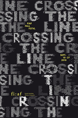
French Institute Alliance Français de New York
2010
Tu m’interroges sur une version contemporaine du Bauhaus. C’était avant tout une école, donc selon moi il faut chercher son écho dans l’enseignement artistique. Avant il y avait les Arts Décoratifs à Paris, quand ils étaient sous la direction de Widmer, maintenant ils me paraissent avoir négligé la vision d’un Widmer ou d’un Paul Rand et être obsédés par l’écriture et la théorie. Je dirais la Cooper Union à New York où j’ai enseigné, qui me semble encore être réellement transversale , « cross-over » tu peux passer de disciplines comme l’ingéniérie, l’architecture à l’art au design. Tout cohabite, même s’ls vont vers davantage de théorie aussi. Cela m’ennuie trop de théorie. C’est comme pour une exposition, je préfère aller la voir sans qu’on m’explique tout, c’est pas grave si je ne comprends pas tout. Toute cette médiation cela peut étouffer l’art, et ce n’est pas grave de se perdre. Maintenant on veut te donner toutes les clés.
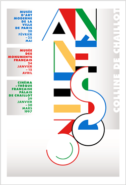
Musée des monuments français Paris
1997
C’est ce qui a peut être le plus évolué ces dernières années, avec bien-sûr la révolution technologique de l’informatique. Je me rappelle encore quand j’ai compris en 1988 en Californie que l’ordinateur allait non seulement remplacer l’équerre mais allait aussi devenir l’outil d’invention qu’il est. Et selon moi on en est encore qu’au tout début. Ou encore au début des années 2000 quand j’ai vu John Maeda qui présentait « Design by numbers » , c’était magique et révolutionnaire, ce qu’il a montré et ce qu’on pouvait faire, c’était fou.
Le confinement ne me gêne pas au contraire, c’est une chance de repli qui donne du temps, qui devient élastique. Individuellement et collectivement c’est l’occasion ou jamais de faire le point sur le futile et l’indispensable dans nos sociétés friandes d’excès. L’essentiel : manger, se déplacer sans aller au bout de la planète. Il serait temps de dégraisser tout cela et notamment le tourisme de masse, qui détruit et pollue. Il serait temps de découvrir que ce qu’on a autour ou à portée de main, a beaucoup d’attraits. Bien-sûr sans aller jusqu’à l’ascétisme. Mais je pense qu’on est au bout d’un système de blockbusters, de black friday, d’avion low-cost etc…
Ce qui me manque le plus c‘est de voir les visages, d’enlacer et d’être enlacé par les êtres qui me sont chers. Et puis la « distanciation sociale » je trouve déjà que le nom est barbare. Le plus beau dans la vie, c’est l’art des rencontres.
Oui j’ai un projet qui me tient vraiment à coeur qui a été remis deux fois du fait de la crise de Covid 19. Il devait avoir lieu le 8 Mai 2020. Finalement il aura lieu le 8 Mai 2021. Dans la continuité de mon livre « Enfants de Paris 1939-1945 », c’est de projeter un millier de plaques commémoratives de la Seconde Guerre mondiale sur les murs de 15 mètres de hauteur du Panthéon.

Éditions Gallimard
2018
Avec ce diaporama, ce sont des images de la mémoire qui apparaissent et disparaissent sur un monument qui s’inscrit dans une forme d’éternité. C’est l’ aboutissement du travail : rendre visible ce qui est passé inaperçu, de rassembler ce qui était éparpillé dans les rues de Paris. C’est comme de projeter des battements de coeur sur le Panthéon.
Et puis l’autre projet qui m’occupe, c’est l’habillage des palissades du chantier de Notre-Dame-de Paris. »
Pour en savoir plus sur le travail de Philippe Apeloig, voici son site :
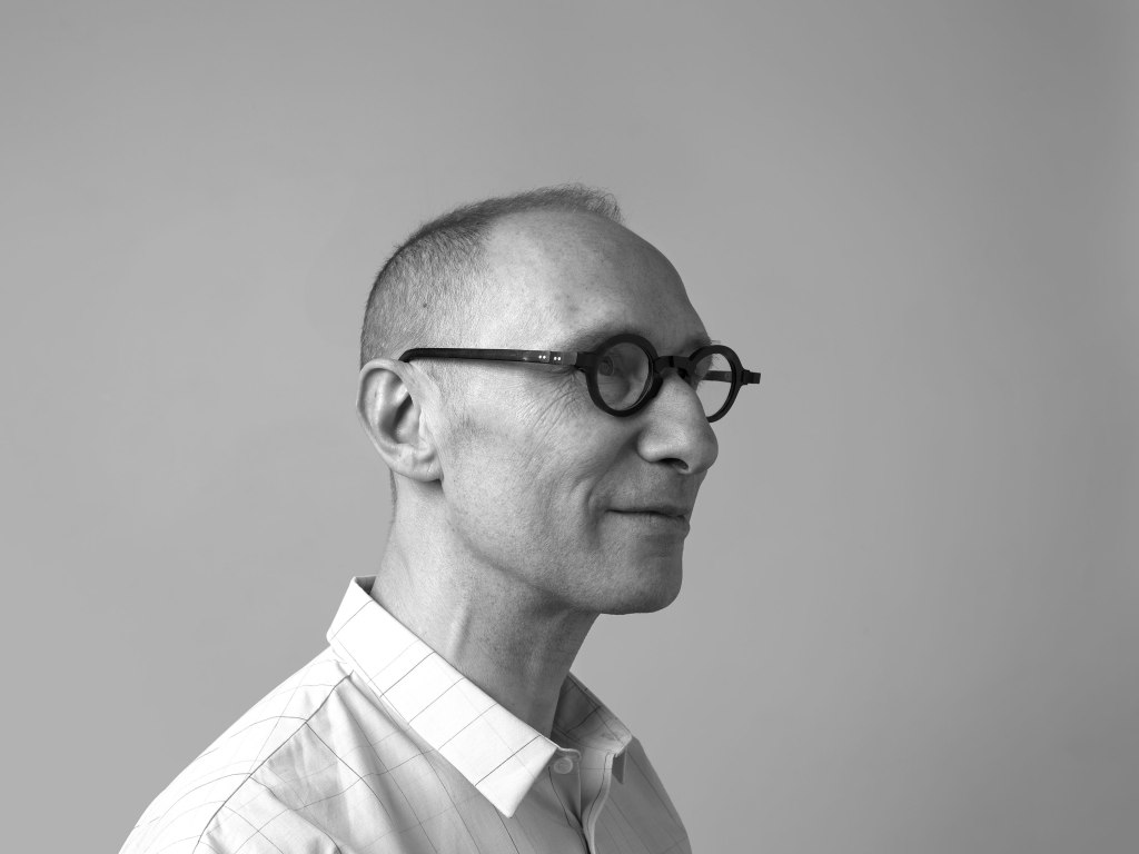
Interview réalisée par Valentine Meyer le 1er Mai 2020 par téléphone.
Philippe Apeloig, the art of typography.
« I chose to be a graphic designer. It was done in two stages, thanks to the chance of encounters. In the 80s, to enter the Duperré School of Applied Arts, you had to choose a course, I enrolled in «Visual Expression/ Graphic Design» without really knowing what it was. I had a very important teacher for me, Roger Druet, who introduced me to calligraphy, Caroline, Gothic, Onciale… I am part of this generation of mutants where everything was drawn by hand, with a Rotring point, a square, a layer. We were taught dexterity, manual know-how that required a lot of effort, perseverance and practice. Afterwards we also tasted the victorious joy of getting there.
In short, in the second year it was necessary to do an internship and this teacher advised me to go to Amsterdam at Total Design. I arrived there in 1983, I was the only French in the middle of Dutch, German, Swiss and British. I learned the rigour and some form of austerity inherited from the Protestant spirit. I returned to France and I prepared the contest at the Decorative Arts of Paris. At the same time, to make a living, I did a lot of illustrations. I always felt shifted. I learned that the Cité des Sciences in La Villette had just entrusted Total Design with the creation of the signage. I decided to return to their home and propose to them to make the link on this project, which they accepted. During this second internship they made me participate in the graphic creation of several projects for the Boijmans museum in Rotterdam.
It was really at that moment that I chose graphic design because I understood that I could infuse it with everything I loved: movement, dance, staging, painting. At the same time I discovered the collections of the Stedelijk Museum. Everything spoke to me, everything connected: abstraction, geometry, which could be used expressively and not just functionally or in the form of a political claim. In short, it also suited my desire for independence.”
Philippe Apeloig is known for his posters, including the exhibition «Chicago, birth of a metropolis» at the Musée d’Orsay and that of «Yves Saint Laurent» at the Petit Palais, by example. He creates typographies and alphabets distributed by the Nouvelle Noire foundry and visual identities including that of the Direction des Musées de France. We owe to him the logos of the Chaumont sur Loire domain, of Puiforcat, of the Yves Saint Laurent museum in Marrakech, to name but a few. Teaching in the United States for 5 years, at Rhodes Island School of Design and then at the Cooper Union of Art in New York, his work has been exhibited internationally. In 2013, the Musée des Arts Décoratifs de Paris dedicated its first retrospective, the Stedelijk Museum in Amsterdam, the Dai Nippon Printing and the GGG Ginza Graphic Gallery in Tokyo also exhibited his work.
« In my opinion, a visual identity must succeed in creating an acronym that is part of everyone’s memory and that provokes an indefinable emotion. This requires that it be purified, otherwise it is difficult to remember. That being said, it is like a summary of the text, it must not be too dry either, hence the emotion to breathe. Then come a lot of technical constraints, the functional and the fact that it can withstand in time while it is very linked to the ephemeral, that of posters and magazines. An identity lives a certain number of years, it accompanies us all, it has a popular art dimension.
Art is like oxygen or water. We need that, there is something vital and at the same time that leaves a trace in the memory. Artists, often in spite of themselves, are in transgression, free as air and necessary as water. They have this need to express themselves, to magnify, with an emotional dimension.
My first job was for the Musée d’Orsay. It’s undeniable, I owe them a lot. I answered an ad, they chose me as an in-house graphic designer when I was very young and inexperienced. Thanks to them, I participated in the opening of the museum, I arrived in 1985 and the opening was in December 1986. Since I was in charge of non-commercial publications, I created the poster for their first exhibition. «Chicago, birth of a metropolis» set the tone for what the museum would be and what it would not be. It would not be a museum only of paintings, or only dedicated to the 19th century. It would be multidisciplinary and international focusing on architecture, sculpture and painting made between 1848 and 1914, that is, between the Second Republic and the First World War. As a spectator, we came face to face with the sculpture, without really any paintings around. It was strong.
You ask me for my inspirations. For my discipline, I think of Paul Rand, of course. He is a pioneer of American graphic design, he built a school of design: image culture, branding, pop art, from the consumer society. He has implemented a system of brand recognition, among other things he has created logos of IBM, Yale and for several transport companies that still last. In short, he was a visionary, an icon of modernity that transgressed a lot to get there.
Obviously the encounter with the works of Mondrian was also decisive. It is a didactic look on how to succeed in subtracting and abstracting to restore the balance of the tree, of the body, of the world. Cézanne for simplicity, an apple becomes extra-ordinary. And then Fellini’s films before I even started the design, for me everything is there.
You’re asking me about a contemporary version of the Bauhaus. It was above all a school, so in my opinion we must seek its echo in artistic teaching. Before there was the Decorative Arts in Paris, when they were under the direction of Widmer, now they seem to me to have neglected the vision of a Widmer or a Paul Rand and to be obsessed with writing and theory. I would say the Cooper Union in New York where I taught, which still seems to me to be really transversal , «cross-over» you can move from disciplines like engineering, architecture to art to design. Everything cohabits, even they go towards more theory too. It bothers me too much theory. It’s like an exhibition, I prefer to see it without being explained to me, it’s okay if I don’t understand everything. All this mediation can stifle art, and it’s okay to get lost. Now we want to give you all the keys.
This is what has perhaps evolved the most in recent years, with of course the technological revolution of computing. I still remember when I realized in 1988 in California that the computer would not only replace the square but would also become the tool of invention that it is. And in my opinion, we’re still at the very beginning. Or in the early 2000s when I saw John Maeda presenting «Design by numbers», it was magical and revolutionary, what he showed and what we could do, it was crazy.
Confinement does not bother me on the contrary, it is a chance of withdrawal that gives time, which becomes elastic. Individually and collectively it is the opportunity or never to take stock of the futile and indispensable in our societies fond of excess. The main thing: to eat, to move without going to the end of the planet. It is time to reduce all this, especially mass tourism, which is destroying and polluting. It would be time to discover that what we have around or at hand, has a lot of attractions. Of course without going as far as asceticism. But I think we are at the end of a system of blockbusters, black Friday, low-cost aircraft etc… What I miss most is seeing faces, hugging and being embraced by my loved ones. And then the «social distance» I already find that the name is barbaric. The most beautiful in life is the art of encounters.
Yes, I have a project that is very close to my heart and has been postponed twice because of the Covid 19 crisis. It was supposed to take place on May 8, 2020. Finally it will take place on May 8, 2021. Following on from my book «Enfants de Paris 1939-1945», it is to project a thousand commemorative plaques of the Second World War on the walls of 15 meters high of the Pantheon. With this slideshow, these are images of memory that appear and disappear on a monument that is part of a form of eternity. It is the result of the work: to make visible what went unnoticed, to gather what was scattered in the streets of Paris. It’s like throwing heartbeats at the Pantheon.
And then the other project that concerns me is the dressing of the Notre-Dame-de Paris yard palisades.”
To learn more about Philippe Apeloig’s work, here is his website:
Interview conducted by Valentine Meyer on May 1, 2020 by phone.
